

U.S. Trading New Product line up
They source goods from domestic factories and export them globally, or import foreign products to sell to US businesses.
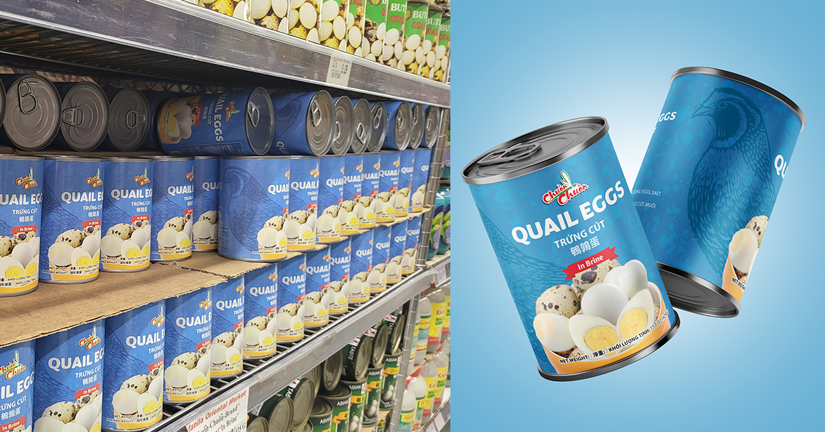
3,000 + Store
All across the US asian market shelves.
Over 100
New products now using that brand.
My Role
I lead the art direction and design strategy for an upcoming product lineup, architecting the core brand identity and executing the logo to anchor the entire product ecosystem.
Brand Logo Design
Creating a new brand logo for a new product line up.
Background
Background
Creative Director
Tools
Google Slides • Photoshop
A/B Testing • Google Sheet
Timeline
January 2025 ~ February 2026
Process
What I did!
01
The Challenge
Translating Cultural Heritage into a Modern Product Identity
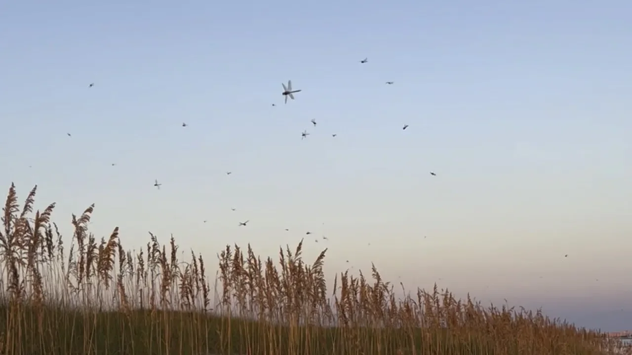
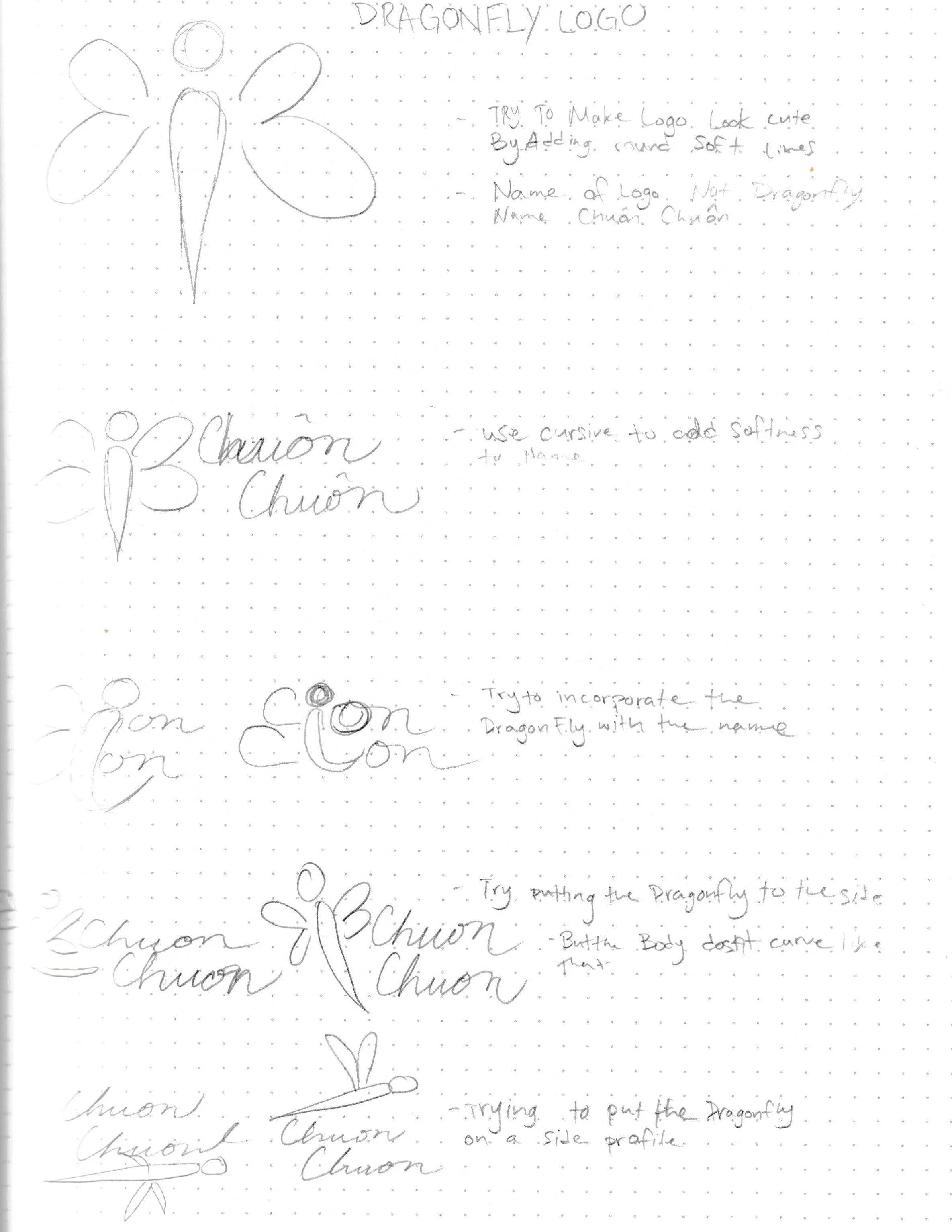
The objective was to design a flagship logo for a new product line that honored the brand’s Vietnamese heritage. The primary challenge was to create a visual representation of a "Dragonfly" (chuồn chuồn) that felt modern and premium, while specifically conveying the core brand values of Trust and Family.

02
Strategy
The "Core Values" Visual Framework
I established a strategic foundation before moving into the design phase to ensure the visual hit the right emotional notes:
Cultural Symbolism: Researching the dragonfly’s meaning in Vietnamese culture—representing adaptability and transformation—and finding a way to merge that with "Family" and "Stability."
The Trust Factor: Selecting a visual style (lines, weight, and geometry) that felt established and reliable rather than "trendy."
Mentorship Brief: Instead of working in a vacuum, I prepared a creative brief for a Junior Designer that outlined these pillars, setting clear expectations for the "look and feel" of the new product line.


03
Execution
Mentorship & Creative Direction
This project served as a key exercise in creative leadership and quality control:
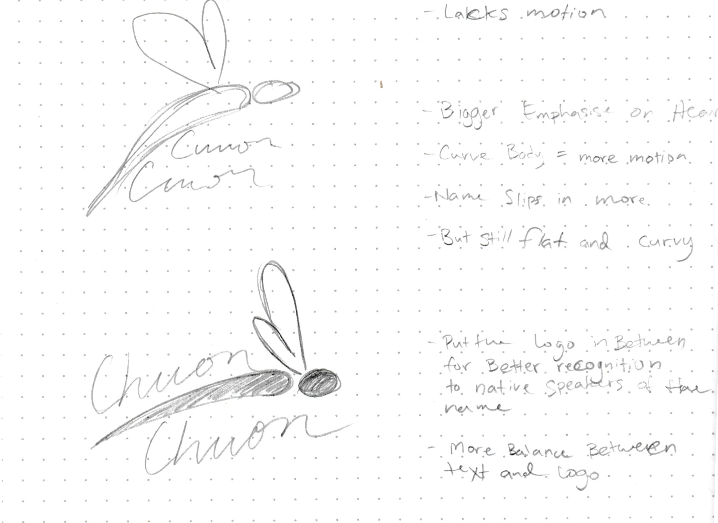
The Foundational Concept: I personally developed the "Base Look"—the core silhouette and structural concept of the dragonfly—to ensure the brand’s DNA was sound.
Directing the Talent: I mentored a Junior Designer through the refinement process. By providing high-level feedback and requesting specific revisions on line weight, balance, and color depth, I empowered them to bring the vision to life while maintaining my strict quality standards.
The "Pink Depth" Refinement: I guided the final aesthetic polish, ensuring the logo utilized our signature "Solid Pink" in a way that added depth and ensured the mark would be legible across 100+ different product applications.
04
Results
Validating the Pivot & Scaling Engagement
Initial Market Validation: The first week of the refresh successfully halted the performance decline caused by creative fatigue. The data confirmed a renewed audience interest, providing the strategic "green light" to move from the experimental phase into full-scale production.
Tripled Audience Reach: By the second week, the new creative direction achieved a major breakthrough in visibility. Ad impressions surged from a 3% baseline to 9%—a 200% increase in reach within just 14 days.
Proof of Concept: The success of this experiment validated the new visual pillars. It proved that the updated aesthetic could successfully cut through market noise and recapture audience attention that the previous, oversaturated designs had lost.

Next project
Problem Solving Turnaround
Let’s Collaborate on Something Amazing Together!
Jose Federico De Jesus